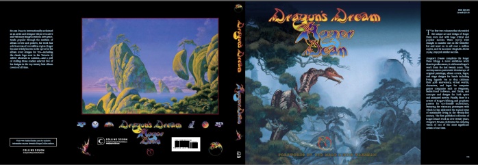
MIKE TIANO: Iĺd like to start with the book. I was looking over what you
sent me, on the cover notes on ôDragonĺs Dreamö, which is the latest
collection of your work. [The notes say] it completes the trilogy,
but was a trilogy always the intent?
ROGER DEAN: This is not a trilogy; itĺs just the third book. There might be
ten books for all I know, and I hope. I certainly have others in
mind; I certainly have others planned, so when I first saw that they
put trilogy on this, I was pretty pissed off with them. That was the
people at Ilex Press (laughs). I donĺt know why they did it. They
still use the word ôtrilogyö, and they insist I approved it, but I
think thatĺs bullshit. This is not a trilogy; itĺs merely the third
book in a series that hopefully will go on a lot longerůnot my
thoughts and not my words. If it gets used anywhere, and it almost
certainly will, itĺs because I didnĺt catch it in time.
MOT: What do you want your fans and followers to know about this new
book?
RD: Well, basically itĺs completely new work; itĺs not a revision of
the old work. Itĺs completely new work; thereĺs more paintings in it
then in ôViewsö and ôMagnetic Stormö put together, with a lot of new
work. Itĺs a much bigger book. If youĺre into my work, you should
definitely buy it, because you wonĺt feel short-changed on this one
(laughs).
MOT: Does it cover a broad spectrum in terms of all your works:
stage sets, paintings, architecture?
 RD: It covers all those things, yes. Mostly I wanted to focus in on
the paintings and the drawings. Having said that, though, itĺs a
very high proportion of my paintings. Itĺs probably 70% of the
paintings Iĺve done between the last book ôMagnetic Stormö [and this
book] coming out. Itĺs only the tiniest fraction of the drawings,
because Iĺve got thousands of drawings. Iĺve probably got four
thousand drawings, and thereĺs probably 20, 30, or 40 in the book; I
donĺt know. So I might do another book on drawings. In fact, I have
been in talks with people to do a series of publications of
sketchbooks, so that is a real possibility in the near future. That,
in itself, will stop this being the trilogy. Iĺve got a lot of
design work too thatĺs not included. Some I just simply forgot;
others I thought Iĺd save for another book. There just wasnĺt room
to put in all in. RD: It covers all those things, yes. Mostly I wanted to focus in on
the paintings and the drawings. Having said that, though, itĺs a
very high proportion of my paintings. Itĺs probably 70% of the
paintings Iĺve done between the last book ôMagnetic Stormö [and this
book] coming out. Itĺs only the tiniest fraction of the drawings,
because Iĺve got thousands of drawings. Iĺve probably got four
thousand drawings, and thereĺs probably 20, 30, or 40 in the book; I
donĺt know. So I might do another book on drawings. In fact, I have
been in talks with people to do a series of publications of
sketchbooks, so that is a real possibility in the near future. That,
in itself, will stop this being the trilogy. Iĺve got a lot of
design work too thatĺs not included. Some I just simply forgot;
others I thought Iĺd save for another book. There just wasnĺt room
to put in all in.
MOT: Youĺre fairly prolific, and probably like most artists you tend
to sketch whenever the muse comes, so I would assume you probably
have piles of stuff in your home (laughs).
RD: I have a lot of stuff, yeah. Itĺs not all at my home, but I have
it. Of course, I put in some architectural stuff. I put in some
stage stuff. Unfortunately I didnĺt get a chance to put in the
finished opera stuff, which I thought looked great, but we had the
sketches in there.
MOT: I think one thing we discussed earlier was that this book also
contains some unseen paintings based on some of your classic Yes
works; unseen paintings like RELAYER, is that in the book?
RD: Yeah, yeah. There is a
RELAYER painting in there that has not
been seen before. I was going to put more RELAYER stuff, but I
didnĺt, because thereĺs quite a bit of RELAYER stuff thatĺs never
been seen--mostly drawings and other ideas (laughs). I even have a
little piece of a castle in the opera that looks a bit like RELAYER.
Yeah, RELAYER has had a much busier life that has ever been seen,
thatĺs for sure. Actually, thatĺs true of a lot of my paintings.
MOT: In addition to this new book ôDragonĺs Dreamö, ôThe Album Cover
Albumö has also been updated; in todayĺs age of downloading music to
your computer and artwork is no longer really part of the total
package, I was curious as to what was the intent of this book: to
capture a lost art?
RD: Yeah, I guess in a way it is a lost art; not really a lost art,
but a lost scale, a lost impact (laughs). A CD cover just isnĺt the
same thing, is it?
MOT: No, itĺs not, and you see CDs going by the wayside--as I said
you download music directly to your computer--and usually I would
think thereĺs probably no artwork associated with it.
RD: Well, what I think has been the tragedy and the idiocy is that
when the scale went from 12x12 to 5x5, record companies, instead
of thinking we have to work hard to give perceived value now, they
did the opposite. When Atlantic did CLOSE TO THE EDGE, for ten years
CLOSE TO THE EDGE was without the painting. And the message that
theyĺre telling the public is that this is a piece of rubbish; we
donĺt care for it, discount it, disrespect it, basically. I think
thatĺs a tragedy, a shame.
MOT: Yeah, youĺre right. For some reason when they first released
all those '70s Yes albums, they did it on the cheap, so you got just
the outside coverů
RD: Yeah, the inside printed in black and white without the imagery.
MOT: Or even without lyrics. Without the actual original packaging,
which they somehow rectified later, which was probably for them, a
canny move to create more revenue. If you already ran out to buy
CLOSE TO THE EDGE as a crappy CD version, now get it in the deluxe
CD version.
RD: Well, I donĺt think it would have created more revenue. Youĺre
talking fractions of a cent to print the inside in color. It was
just a kind of tacky, really mediocre way of thinking, and it
explains why people bought Japanese imports, because they took a
great deal more care.
MOT: Yes, absolutely, the Japanese were the first to come out with
the little mini-reproductions. I have a few of those.
RD: Theyĺre very nice.
MOT: Yeah, they were very, very nice.
RD: And hereĺs the thing--and Iĺve said this a dozen times, so Iĺm
repeating myself--but the attitude of Japanese, whoĺs very much that
they honor the music; they honor the customer, and they treat it as
a gift. Music is a gift in every sense and so is the art. Itĺs a
gift, and it should be treated like a gift. It should be carefully
wrapped and packaged and presented. The way theyĺve been doing it
[outside of Japan]--itĺs not a gift. Itĺs a tool, and a pretty
utilitarian one at that. Itĺs like giving someone a book token; itĺs
not the same thing as giving someone a book.
MOT: But do you think one of the problems with the Yes albums was
the fact that Yes probably didnĺt have ownership of their own work
at the time? Iĺm speculating here, because you look at some of the
other artists [who controlled their releases] like David Bowieů
RD: I donĺt think that was the issue. The issue is that the US and
UK record companies did it to everything. It was just an attitude of
mind; ok, we can save 1.01 of a cent on every sale didnĺt mean much,
because it meant that the gross value of the sales was probably
down; it was just very, very, very shabby thinking, I think.
MOT: You donĺt think that the band itself somehow figured into this?
If memory serves, David Bowie held on to his catalog, but once he
released that to CD he made sure everything was perfectly right
about the releases. So he owned the catalog, he made sure it got out
there in the right way, and Iĺm wondering if Yes just didnĺt have
either the interest or the control to do the same thing.
RD: I canĺt answer that. I know that I was very distressed about it,
and there was no one I could address the issue with, particularly at
Atlantic. There was no sense of anyone giving a damn.
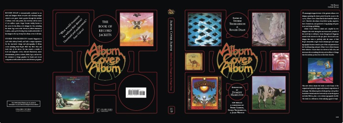
MOT: Going back to my core question about this updated version of
ôThe Album Cover Albumö, what was the goal behind revising it and
putting it out there?
RD: Well, really there is a whole generation of people who are just
not used to album covers, not used to buying albums except in
collector stores and second-hand shops, and it seemed very
worthwhile showing people the best of what there was. Like anything,
you need a good history, and this was an excellent history, and it
had been out of print for a long time, so it seemed like a good idea
to put it back into print.
MOT: I think itĺs probably a very laudable idea too, and hopefully
itĺll make some of these younger artists think about presentation of
their own product, because it goes beyond just the music; it helped
create a totality in terms of the presentation of the music.
RD: Itĺs a totality in terms of the story of the music; itĺs a
totality in terms of the culture of the music, and it is an attitude
of mind in terms of treating the music as a gift, a thing to be
honored. It is just a much more important thing than a few cents of
wrapping paper.
MOT: Itĺs just a richer experience. Iĺm not saying music alone isnĺt
rich, but it really contributed to the whole aural experience.
RD: Yeah, Iĺve been talking about Atlantic, but Ahmet Ertegun and
the others whoĺve founded Atlantic were very keen on doing it right
originally, but I guess they lost control as well, I donĺt know. But
in the end, it was a very distressing thing, looking at the way the
product was treated, packaged, and put out and marketed --everything
about it was distressingly mediocre.
MOT: I have a few questions about Yes. The front cover of what is
probably Yesĺ masterwork, CLOSE TO THE EDGE, is in retrospect,
probably one of your most unusual because itĺs not of anything.
There are no objects, there are no figures, there are no landscapes.
Itĺs really just a gradient of sorts. How did the concept for the
front cover develop?
RD: The idea behind it was two or three elements at once. First of
all, there was the brand new logo, and the other thing was to do, to
develop an idea that we tried and not done very successfully with
FRAGILE--to make it look like, not an old book, but a document. It
was an album; we werenĺt trying to make it look like a book, but we
wanted it to have some of that quality of a gold embossed book, so
the original idea was to do the lettering and have a gold embossed.
Naturally of course that never happened, which was a shame, because
it would have been great, and then as you opened it, there inside
would have been the picture, and it was also to bring people closer,
because the painting really you needed to look into much more. It
required a much closer scrutiny than the others Iĺd done so far in
that it was much more gentle in its impact.
MOT: I was wondering if the inside painting had ever been considered
to be the front cover.
RD: Well, not in the sense of it being used as a front cover, but it
is kind of the symbol, the icon representing CLOSE TO THE EDGE.
MOT: I was one of those who bought the original vinyl release, and I
think one thing that did strike me that I found lost in later
editions is the outline of the lettering was very bright silver; it
really jumped out at you.
RD: Yeah, and then it was pretty much grey after that.
MOT: Yeah, just grey. When you mentioned the embossing, that
triggered that memory, because I remember (laughs) going and trying
to find another old copy of CLOSE TO THE EDGEůI donĺt know if you
recall, but there was an Original Master Recording of CLOSE TO THE
EDGEů
RD: Thatĺs right.
MOT: ůand always looking at that, making sure that silver was just
eye-popping like it was in the original release.
RD: Yeah, it was a shame, I mean the least upsetting of the things I
wasnĺt happy with I guess. It looked pretty close to what I wanted
on the first release; not as dramatic as a gold-blocking or
silver-blocking, but still pretty good. I guess though the thing of
having it go out for ten years without the painting was insane.
MOT: Yeah, well thatĺs been rectified, especially in
the Rhino re-release. I have a question about the painting for TALES
FROM TOPOGRAPHIC OCEANS, which is probably one of your most-iconic
as far as the Yes canon goes. One thing I noticed from reproductions of the cover thatĺs
missing from the original cover is the fish are in kind of a slipstream. You can
kind of see this path that theyĺve taken, and thatĺs missing. I was
wondering what the story was behind that.
RD: Well, I never really liked it (laughs), and it wasnĺt part of
the painting. It was added after the painting. A lot of my paintings
Iĺve had to do a little note, a mini-essay in my book to say that
over the years the titles of paintings have changed. There have been
a number of paintings which Iĺve called something for a while then
thought it didnĺt really fit, changed it, and changed it again. And
a lot of paintings have changed too. Theyĺve come out in one form,
and Iĺve changed it, painted something out, painting something in,
so while theyĺre in my studio, their names evolve, and the paintings
evolve, and thatĺs happened to a lot of my work, more than half, I
guess.
The one I use as an example in the book actually is the
YESSONGS painting with the mushroom city in the background, and in
ôViewsö you can see the catĺs footprints in the sky, but the cat
didnĺt just walk on the painting, and I tried to paint out his
footprints which clouds, but that didnĺt work, so they remain
visible, but the cat also at that time, maybe a week or two later or
a month or two later, but after Iĺd have it photographed for
YESSONGS, he sprayed on the painting while it was standing against
the wall.
MOT: (laughs)
RD: So, I did warn him Iĺd have to redo the painting, and I was
going to use his tail (both laugh). I did; I just redid the painting
then, so for years the painting really built a good reputation and
lots ofůhundreds of people wrote to me about the footprints of the
cat across the sky and everything like that, but while the painting
was in my studio Iĺd painted them out, and Iĺd reworked the
painting, so for most of my life with that picture, which is a long
time--30 years itĺs been hanging around my studio--it looked quite
different to the reproductions of it.
MOT: So using that TOPOGRAPHIC OCEANS painting as an example, you
actually went back and you painted out the slipstream?
RD: No, I never painted it in.
MOT: Oh, then how was it added?
RD: I painted it on a piece of clear cellulose; we photographed it
in position, and we photographed it without it, and I preferred it
without it, so when it was used as a poster and everything, it was
without it.
MOT: Is that a technique that you use often?
RD: No, no.
MOT: Why was it added at all?
RD: An idea that Jon and I discussed. Jon was more convinced it
worked than me, and I tried it, but it didnĺt work, so I removed it.
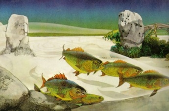 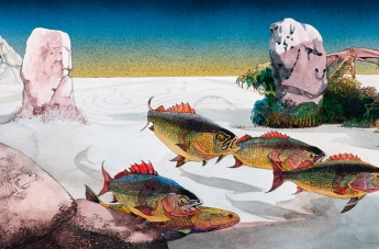
Left: TFTO album cover painting with slipstream;
Right: original without slipstream
MOT: Thatĺs a pretty cool insight into how you work. During the
'70s you had this long role with Yes, and youĺve created quite a few
works with them until GOING FOR THE ONE. Did you ever create any
unseen artwork for GOING FOR THE ONE?
RD: No. I went out to Montreux, where Yes was recording, andůI donĺt
know if they had the title GOING FOR THE ONE when I was out there,
they may have doneůbut I think what happened there is when I got out
there, Jon was actually doing a painting that he wanted me to
incorporate in the cover, and I didnĺt think that would work
(laughs).
MOT: What, you would take his painting and incorporate it into your
own artwork?
RD: It happens occasionally that Jon had these conversations with
me, usually and fortunately heĺs very happy for me to do the
painting, but sometimes he has an idea. When he has an idea, we can
talk about it; but when heĺs doing a painting, it seemed like there
wasnĺt much scope for discussion.
MOT: Did that pretty much break off the relationship at that point,
or were there other conversations as to why your work wasnĺt used
for GOING FOR THE ONE?
RD: That was pretty much it, I think. Itĺs sometimesůyou know, you
need a break (laughs).
MOT: What do you think of the artwork for GOING FOR THE ONE and
TORMATO?
RD: Well, first of all, in general, I think Storm Thorgerson (of
Hipgnosis, who designed the cover for those two albums) is a
brilliant designer; heĺs a good friend as well. Do I think thatĺs
his best work? No (laughs), and I do think that the figure in the
foreground [of GFTO] was absolutely a problem for all concerned.
MOT: You saw the billboard, Iĺm sure.
RD: No, tell me about the billboard.
MOT: When GOING FOR THE ONE came out, if memory serves, I think they
attempted to have the figure buck-naked as on the album cover, but
they ended up painting a pair of blue jeans on him.
RD: Really? I never saw that.
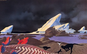 MOT: You returned to Yes with DRAMA, and that was really, for you, a
different piece of art for what was a very different album. Was that
stylistic shift intentional? MOT: You returned to Yes with DRAMA, and that was really, for you, a
different piece of art for what was a very different album. Was that
stylistic shift intentional?
RD: Yeah, as much as any of these things are intentional. Itĺs like
when Iĺm working, I try to do as little conscious manipulating and
thinking about what Iĺm doing as I can and have it work as
intuitively as possible, so Iĺd say that the DRAMA work was very
much an intuitive approach to how to do that cover. I was very
interested in having a very stormy sky; that was something I was
really interested in. I was very interested in the light playing
across the landscape, so there were some bits that jumped out and
very stark and bright, and other bits that are very dark--black on
dark grey. Yeah, there was a lot going on for me in that, and it was
like cooking I guess; I put in the ingredients and stirred it up,
and they came out in a way I guess that training and good luck
worked together.
MOT: It was very appropriate, given the title of the album. Did you
know the title of the album when you created the painting?
RD: Yes I did.
MOT: It is a very dramatic work. Did you have discussions with the
band as far as the content at all? One reason I ask is when I see
the cats running towards the birds, it evokes lyrics from ôTempus
Fugitö, one of the songs on that album.
RD: Actually, I donĺt recall discussing those elements, but I did
discuss the boats, the ships in the desert; that was something Steve
and I had some discussions about.
MOT: Iĺm glad you brought up Steve, because that leads nicely to my
next question. It seems to me your strongest link to Yes is Steve.
Youĺve created logo and artwork for both Asia, a band heĺs in of
course, as well as his own solo work. Can you talk a little bit
about your relationship with Steve?
RD: Yeah, I hope we get on. I certainly like working with Steve, but
youĺve got to understand that Iĺve done a few of his solo albums,
but I doubt if Iĺve done half of them. Heĺs probably done more
pieces without me than heĺs done with me, but I do enjoy working
with him. Weĺve got on, I guess now for, how long would it beů37
years; itĺs a long time. Yeah, I enjoy his company; I enjoy working
with him. For me, itĺs a nice, creative balance
2004 Stage Set - Left: without UV lighting; Right:
with UV lighting
Photos ę 2004 Mike Tiano
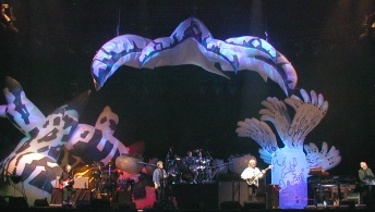
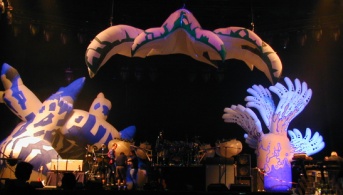
MOT: Iĺd like to move on to the 35th anniversary tour, particularly
the inflatables. [Roger designed the stage set for that tour.] As
you recall, I was there at the rehearsals in Yakima, and you were
still painting sets as the band were rehearsing, but one thing I
found really striking is something that I donĺt recall seeing after
those rehearsals, and that was the use of UV lighting, which really
transformed the set. Am I correct here that after those rehearsals,
the UV lighting was not used?
RD: No, it was used, not all the time. I was walking with the first
lighting designer, and he took a lot of time and effort to work in
my ideas, but we never had time. We just simply didnĺt have time; we
needed at least a week of rehearsal time to put together the
storyboard ideas that I had for the song list, and by the time he
decided he had enough and resigned, that was just before Madison
Square Garden. We pretty much worked on about half of the set, which
is a shame. I thought it was a real shame he left, because he
reallyůwhen I work with a lighting designer, I divide the job into
three elements, is what I consider the basic default look of the
song, the primary color. Itĺs like Iĺm working on a canvas, and
thatĺs what I put my effort into, that default look, so that gives
the lighting designer scope to play around, as long as he refers
back to that default look on a regular basis. Does that make sense?
MOT: Yeah.
RD: So the third element is lighting the band. My default look is
lighting the stage, so the whole stage has a look that is particular
to a song; thatĺs what I try and work out, then how he plays with
that look with the music is down to him, and then how he lights the
band is between him and the band, so if you like, I work intensely
on 1/3 of the job, and the lighting guy has his area of freedom, but
he has another area where heĺs doing a pretty mechanical,
utilitarian job of lighting the band, so as I see it, thereĺs three
parts to that job, and we were working on the part that I just
mentioned to you--getting the default look that made each song
unique.
By the time he left, which was just before Madison Square
Garden, we had really made one good use of that ultraviolet light,
and I thought it was a pretty good use. What I was hoping to do and
was really pushing and pushing to get, was a much darker stage for
one of the songs, particularly ôSoonö. I liked a very dark stage for
ôSoonö, and we hadnĺt got there, and it was a lot of negotiations
with the band, because they didnĺt want to be stumbling around in a
dark stage. They wanted a minimal amount of light, so it was a
negotiating position we were in, and it was at
that stage where we
just really got the hang of using the UV light effectively when he
left, and the guy who took over for himůbasically he wasnĺt
interested in my ideas (laughs); he just went off and did it
himself.
So I have to say at that point I felt this was a waste of my time
talking to someone who wasnĺt listening, so I didnĺt stay on and
work on beyond that point, so I donĺt know what happened. It was
very exasperating for me, because we didnĺt actually get the budget
to build the set until a couple of weeks before rehearsals. We
should have had it six months before, so a couple of weeks before
rehearsals, I had been telling the management if the funding for the
stage doesnĺt come by this particular date, youĺre going to start
getting less or paying more, and of course it didnĺt come. And the
equation wasnĺt just getting less or paying more, it was being
delivered late, getting less or paying more, and in the end, all
three happened. They got less, some of it was late, and they had to
pay more. It was just irresponsible, from my perspective, but we
didnĺt get a lot of the main features of the set, the stage, until
the band went to Europe, in Finland, for the first time, all the
bits and pieces we designed were on stage at the same time, but we
werenĺt getting the lighting effects by then, so it was a bit
exasperating.
MOT: Hopefully things will go a little bit better with the 40th
anniversary tour.
RD: Yeah, I hope so. I have a very good working relationship with
[stage manager] David Wright, and fortunately heĺs going to be back
on this tour, and I like working with people who make my life easy,
and he does. He has the common sense and the contacts to make this
thing work, and he was very aware of the problems I was having on
the last tour with the lighting, and he said heĺs got a lighting guy
for the band in Canada who was interested to work with me on the
lighting, so hopefully that will all work out.
MOT: Can you give us a hint or indications of what we can expect as
far as set designs on this next tour?
RD: Well, itĺs not an inflatable; itĺs likeůI was very interested to
add some gothic arch shapes, so I was looking at a kind of a mad
string of gothic arches, and theyĺre made in stretch fabric, so itĺs
like a sail or a tent--stretch fabric on a frame, and a kind of mad
gothic arch.
MOT: Which I would presume would allow different lighting [depth]ů
RD: Exactly, we can light the band, we can light the stage, we can
illuminate it from inside, from outside, and hopefully weĺll have at
least some movement too, because the key to these things is to keep
the visual entertainment level high, and that requires movement as
well as light.
MOT: One thing I think gets lost in the concert lighting today is
everythingĺs always white. Everything is just bright, and I recall
the days where youĺd have these intense color shifts, and some very,
very bold, bright colors, but it seems like now the goal is always
keep the band white, as like youĺre filming every show or something.
RD: Well, thereĺs an issue here, and the issue is this simple: for
any color to look intense, it looks most intense on a black
background. If youĺre in a very bright stage or in daylight, you
donĺt see the lights very well. So the lights get increasingly
intense the darker the stage gets. In addition, if youĺre showing
RGB lights all on one spot, it comes out as white, doesnĺt it?
MOT: Right, exactly.
RD: Have a red, green, and blue light all on one spot, you get
white, so by putting too much color, you get white. That was one of
the problems with the stage after Madison Square Garden; there was a
misunderstanding, and Jon was looking for more color, but as they
increased the range of color, it got whiter, which is a natural
consequence of mixing too many colors at once on the same place, so
the issue about getting bright and dramatic color is definitely less
is more.
MOT: I think direction is always a big factor as well, because if
you have like a red coming from the very front and a blue coming
from behind, theyĺre not coming from the same angle, so they donĺt
mix together, so you have more of a halo type of effect.
RD: Yes, or if you have them from the side, so theyĺre on different
planes, so that is what we try to do. We try to have the facades
clearly delineated by light, and we could use different colors that
way. But you know itĺs complicated, and it takes time to set it all
up. Iĺve been working on this opera initially, and they have very
simple lighting compared to rock and roll. Even so, it probably took
20 hours just to go through each act and point the lights, and make
them aim in the right place. It takes time, and it takes time to
rehearse and storyboard the lighting effects, hopefully weĺll have
the time this time.
MOT: I want to go back to the 35th anniversary tour. Another
question I had was that some of the more cynical fans felt that Yes
were going kind of cheap with the inflatables. Obviously budget is
always a big consideration for the approach youĺre going to take,
but I guess I was interested in your comments about why you took
that approach for that tour. It was strictly a budget or just
basically you had these ideas for inflatables that you wanted to put
forth.
RD: Well, there is quite a complicated answer for that. Basically it
works this way. Thereĺs two costs about the stage set. One of them
is building it, and the other is shipping it. And the inflatables,
no question about it, were cheaper to build and much cheaper to
ship. So there was definitely a cost advantage with the inflatables.
But thereĺs another issue as well, and that is that thereĺs certain
types of shapes that are particularly suitable to certain types of
processes. The fiberglass stuff we used, fiberglass can pretty much
do anything, but it takes a lot of effort to make it get good,
simple curves. We can get good, simple curves quite easily with
inflatables and stretch fabrics, so on this particular tour and the
last one, we are alternating between stretch fabric and inflatables,
because of the shapes they make. The primary reason for using
inflatables was because of the ease with which we could get
particular shapes; but there is a cost, you know. I understand that
U2 tours with a duplicate set, and they, on alternate nights, they
have alternate sets, so the sets leapfrog. Thatĺs an expensive
luxury; not all bands can afford that.
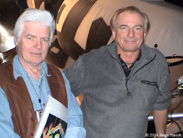
Roger with Alan White at 2004 Tour
rehearsals
MOT: Yeah. U2ĺs pulling in the numbers to allow that type of thing
to happen.
RD: Yeah, and Yes did once, but the thing about the set is itĺs
basically there to entertain and to look amazing, and I thought with
the inflatables, we could do all that.
MOT: In some ways it echoed the Crab Nebula set of 1976. I think if
I had to choose one Yes tour that I thought was the most
visually-stunning, it would have to be that tour. It was really one
of the most inventive stage sets of that era, with its intense
palate and the depth.
RD: I agree. I would agree with you in every way on that; itĺs the
one I thought was the most dramatic. Itĺs certainly the most weird
and it takes you absolutely into another world--most stunning. I
didnĺt have anything to do with that, though (laughs). That was my
brother. He did it entirely himself.
MOT: Well, itĺs a good thing to strive for (laughs).
RD: Yeah! Yeah, I mean..
MOT: I wish we could bring that back, because like you say just
mention the depth and just the palate of colors --it was just
stunning. I wish there was a good visual document of that tour; I
really do.
RD: Can you believe how much we do too? Thereĺs no real record of
that.
MOT: Which is a real shame. It was probably Yesĺs ultimate tour,
they continued to draw the numbers for a little while after that,
but thatĺs where they played JFK stadium and did all these gigantic
arena shows, so that gigantic set lent itself to that.
RD: They did film it, by the way.
MOT: Was it officially filmed?
RD: Oh yeah, I think there were six cameramen and a director, and
they filmed maybe a dozen concerts.
MOT: Oh really?
RD: Yeah.
MOT: What happened to that footage?
RD: Well, you know itĺs theůfrom the Yes world, itĺs the big
mystery. Where is and what happened to that footage? I mean, thereĺs
a lot of it, thatĺs probably, I donĺt know, a 100 hours of film
somewhere.
MOT: Yeah.
RD: Somewhere someone has it, and I believe it was 35mm too, not 16,
so itĺsůsomewhere thereĺs some good quality film of that tour.
MOT: Itĺll show up in somebodyĺs garage or warehouse some dayů
RD: Well, that would be good. What would be not good is to find out
that it was scrapped.
MOT: Yeah, or to never find it again. So youĺve been so
closely-associated with Yes, Roger, I had to wonder when you have
worked for the clients creating album covers and such, did they ever
convey any concerns, say something like, ôI donĺt want it to look
like a Yes coverö? (laughs)
RD: Well, one band in particular; usually people want it to look
like a Yes cover. Thatĺs a much bigger problem for me (both laugh).
I have to steer them away, but of course the one band who did
absolutely not want to look like Yes was Asia. In fact, they
didnĺtůthey were very apologetic and kind to me and said, ôWe canĺt
use you to do the covers; weĺve got to look totally different to
Yes,ö and I said thatĺs fine; I understand. And I met up with Steve
one day when I thought it was all finished and put to bed, and I was
in the studio with him and they hadnĺt got a cover. They had maybe
half a dozen covers, but they didnĺt have one that was working for
them; and I said I could do your logo that was completely different
from Yes simply by making it very angular and sharp-edged, and if we
did something like a dragon--Yes had never used a dragon--so I said
that, and in two strokes, youĺre completely different to Yes, except
that of course itĺs still me doing the painting. Anyway, I guess
thereĺs a combination of them thinking that might work and the fact
that (laughs) theyĺd run out of time. I did it, and for me it
worked. I think the covers I did for Asia are still recognizably my
work, but nevertheless, completely different to Yes.
MOT: I thought it was interesting when made a comment you made
earlier that some artists wanted it to look like Yes, and I guess
one thing you donĺt want to do is be a derivative of yourself.
RD: Well, you know, people come to me, because they think itĺll help
them commercially. Hopefully most people come to me because they
simply like my work, in which case I can do the best I can for them
without aiding and abetting them in looking like Yes. I usually
wouldnĺt do a cover for a band who was simply setting out to play
like and look like Yes; I donĺt think I would do that.
MOT: Got to be some type of challenge for you or some interest
beyond just getting a job.
RD: Yeah. Yeah.
MOT: Moving onto a different type of question: youĺve designed quite
a bit of architecture in your career. I was wondering if any of your
designs were built and actually inhabited today.
RD: No, unfortunately no. Iĺve got a commission as we speak for a
group of four houses, and I have a number of other commissions in
discussion--sorting out contracts and stuff. Iĺve often had that,
and sometimes theyĺve not comeůtheyĺve been cancelled, and sometimes
theyĺve just been postponed, so Iĺve got a number of projects which
I would say the client has on the backburner while they sort out
planning or money. These often take a long time; Iĺve got, as I say,
one or two which I think could happen soon. I will make a huge song
and dance about it when it happens.
MOT: Because thinking back on ôViewsö you had some pretty unusual
designs for actual living space, and thatĺs why I was wondering had
any of these actually have been built and were inhabited and people
enjoyed being in that environment for long periods of time.
RD: What has happened is that I have been asked occasionally if I
would tone down the designs, and Iĺve always said no, that would be
ridiculous. If someone asked me to do a painting and make it look a
bit more ordinary, I would simply say no. Why would I want that? The
two projects I have, which look as if theyĺre likely to start in the
new year, the opposite is the brief. The brief is to go flat-out and
make it as amazing as possible, and that would be the decorative
detailing, and the interior is a psychological role for the shapes,
and they are as right as they can be now, but the decorative bits,
they can be very interesting and the pathways and the walkways
around the property give me scope for a lot of interesting stuff.
MOT: How much does technology play into this? I would assume you
would want your dwellings to be green in the sense that they be
energy-effective. How much do you think about that?
RD: We have terrific advantage over conventional buildings just from
the shape alone. They are much more energy-efficient than a
conventional building, regardless of technology--just by the shape.
MOT: So these are considerations that you think about when you
designů
RD: Very much part of my interest back in the
'60s when I first
started thinking this way, both be energy-efficient and not to use
toxic materials. I mean, when I was a student, I read Rachel
Carsonĺs ôSilent Springö, and it gave me a terrific awareness of the
toxicity of a lot of materials we use in building and making things,
and I just thought I need to be able to design a house that uses no
toxic materials, and I think weĺve done that, pretty much eradicated
the plastic and the toxic materials from the build.
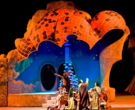
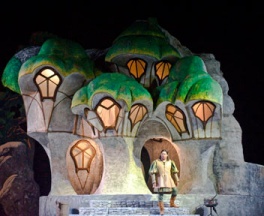
View the photos for Edgar at
Il Sole 24 Ore
Photos ę 2008 La Bottega dell'Immagine
MOT: So, winding down here, just want to talk a little bit about the
opera. I did find a website that had photographs of your work there.
This was a stage set that you created for ôEdgarö, a Puccini opera
that was done in Italy, and your daughter [Freyja Dean] was a
costume designer. I was just wondering how closely you worked
together, so you had a synergy between the set design and the
costumes, if there was any.
RD: Itĺs very funny, because as a child, she would be drawing away,
and Iĺd say, ôHey, I can tell you how to paint that,ö and sheĺd say
basically, ôDad, leave me alone; I know how to do itö (both laugh)
MOT: Runs in the family.
RD: Sheĺs very young, 3-4 years old. I think in her whole life, she
let me show her how to paint an eyeball; thatĺs the only thing.
Everything else was, I mustnĺt interfere. So to get involved with
her painting--and I have to say that I considered it a terrific
advantage for her to have me to teach her, but she never wanted to
know (laughs); sheĺd never take advantage of that--so I had to kind
of trick her, and it was like a big treat to her; if she behaved
very well, I would let her work on a painting with me, and from when
she was tiny, she worked on paintings with me. Iĺve got a picture in
my book of her working on the background to the UNION album cover,
and she must be 2Ż-3 years old, something in there, and she painted
the whole 6ĺ x 4ĺ canvass blue, and all her brush marks are still in
the painting. You can still see her brushstrokes; I just used them
as texture, but I used them, and as the years went on, she would
always prime my canvasses, so she primed pretty much every canvass I
ever worked on. Maybe she put two or three coats of white paint on
it, and Iĺd put one or two in addition, so itĺd have five coats of
primer, sheĺd put two or three of them on--as a special reward, I
wouldnĺt let her do that just for nothing (laughs). And as she got
older she did more and more of the painting, to the extent that I
did an album cover for Osibisa just this last few months, and while
I was working in Italy, they had some financial issues, because they
had new governments in Italy, and they didnĺt commission the costume
maker, so she was in England, not working on the opera, in the early
summer while I was out in Italy working on it, so she painted the
Osibisa cover for me (laughs), so itĺs gone from letting her do the
background to her doing the foreground and me doing the odd detail
now and then, so what can I say? She had worked with me.
MOT: Is this the first time that you worked with Osibisa, since that
original cover you did many, many years ago?
RD: No, Iĺve worked on and off with them over the years.
MOT: Going through these photographs of your stage sets for ôEdgarö,
theyĺre very striking, and again points to how lighting can really
illuminate the various aspects of the stage set, like Iĺm seeing
a building of some sort and in one photo
theyĺre all blue with orange interiors, and then the next photograph
shows them like white with green roofs...lighting can
actually change a stage set.
RD: Yeah, thatĺs Act 1, and Act 1 starts at night and it gradually
becomes daylight in the act, so youĺre looking at a night scene and
a daytime scene all within Act 1.
MOT: Well, itĺs very striking, and hopefully it was a success. Itĺs
still running now?
RD: Ah no, itĺs a summer festival, and itĺs over now; however they
did film it, so hopefully there will be a DVD available at some time
hopefully in the new year of the opera.
MOT: Oh wonderful. So closing on the Orphan Works act--Iĺll provide
the background for our readers as to what this is, but my main
question for you is--has any progress been made regarding striking
this act down?
RD: Not that Iĺm aware of. I think itĺs a complete disaster. Itĺs
just about greed; itĺs about a bunch of big companies wanting access
to stuff they never made any effort or spent any money creating. It
will be very costly and very devastating for artists. It will be
very, very difficult to protect copyrights if it gets passed. It is
a complete disgrace. It serves no cultural, positive purpose
whatsoever.
MOT: Then, what was the intent in doing this in the first place?
RD: The intent in doing this in the first place is that two or three
very large companies make a lot of money selling art, clip art, and
this would allow them to sell a great deal more art that doesnĺt
belong to them that they didnĺt make and they didnĺt commission,
make a lot more money, and it would be at direct cost of all the
artists who created it. There is no reliable way of recording
artwork, and itĺs, as I say, a disgrace. Itĺs a cultural disaster
and a disgrace, but both American and British governments had the
fig leaf of saying it was the heritage purposes to protect things,
such as movies, that might disintegrate and not be rescued if there
the copyright act was preserved, but it would have been very simple.
It would have been ridiculous--no-brainer--to put it in a clause
in the copyright act allowing for heritage protection, the same as
they have a clause in the copyright act allowing for fair comments
by journalists. It was not a issue, and it was, as I say, it was a
pathetic attempt at a fig leaf to hide monumental greed.
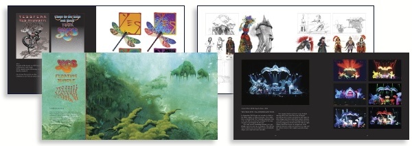
Pages from Dragon's Dream
|